Seeing Red
Red is a strong and bold color. There’s a reason they use red in stop signs and stop lights: it’s such an attention-grabbing color, it’s nearly impossible to ignore. So it’s no wonder people react strongly when they encounter it. A red background or red wallpaper is going to stand out; the job is making sure it stands out for the right reasons. Below: ready-to-download red backgrounds, the shades and codes to build your own, and the history and symbolism behind the color.
Red color codes
Gallery
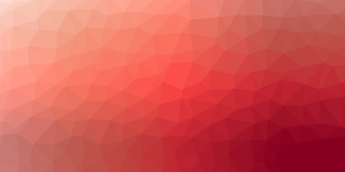
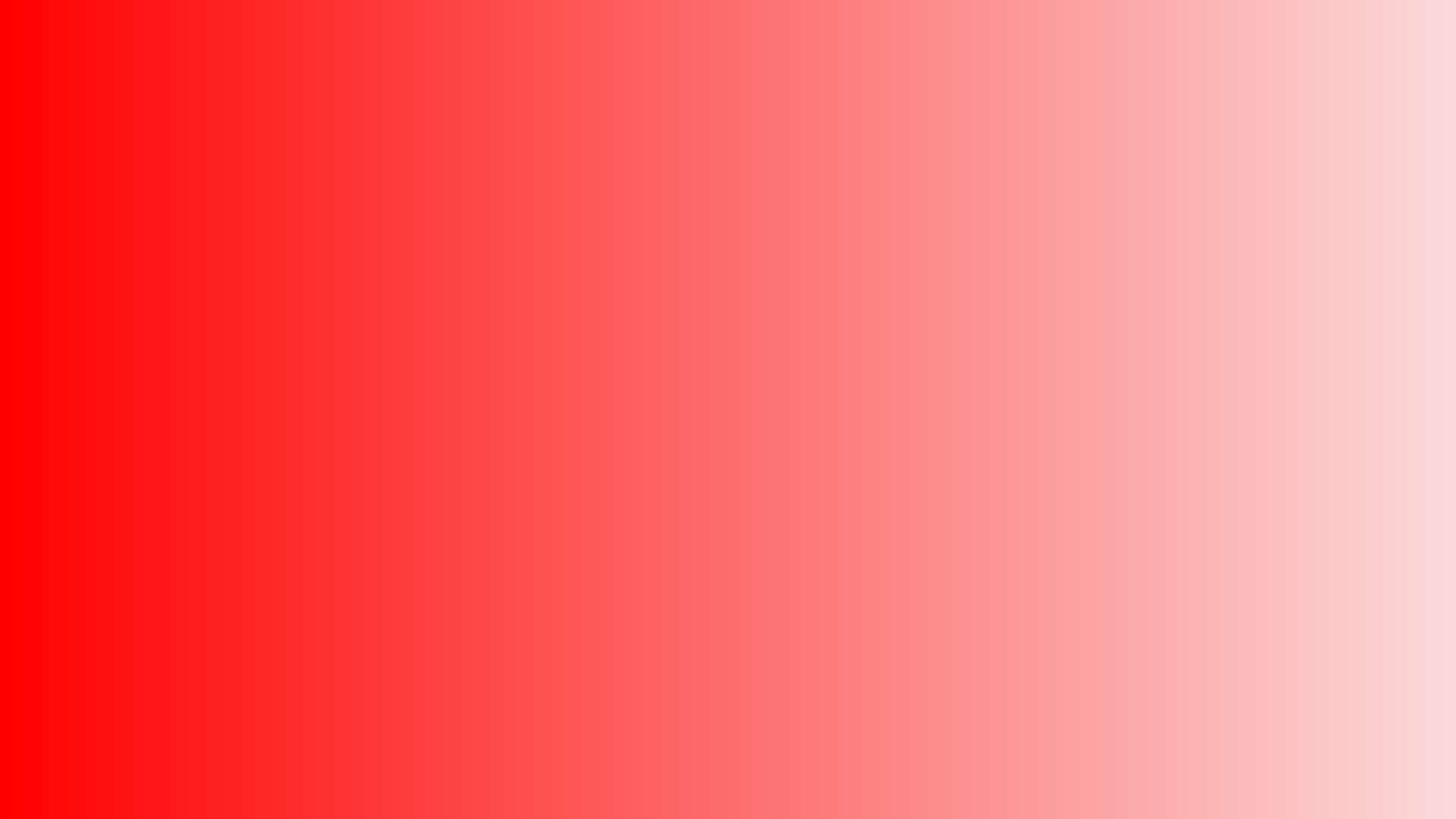
A sample of ready-to-use red backgrounds. Hover any image and hit the download button to grab the full-resolution version.






Ways to use a red background
- Wallpaper: a bold red wallpaper for your desktop or phone; every image above downloads at full resolution.
- Plain & solid: a clean red fill behind product shots, thumbnails, or slides; grab an exact shade below.
- Web & design: red backgrounds drive action, which is why they’re a staple of ecommerce heroes and banners; consumers respond to red. Pairing red with black packs the strongest visual punch — a red and black background looks sleek on a site and elegant as a phone wallpaper.
Shades of red
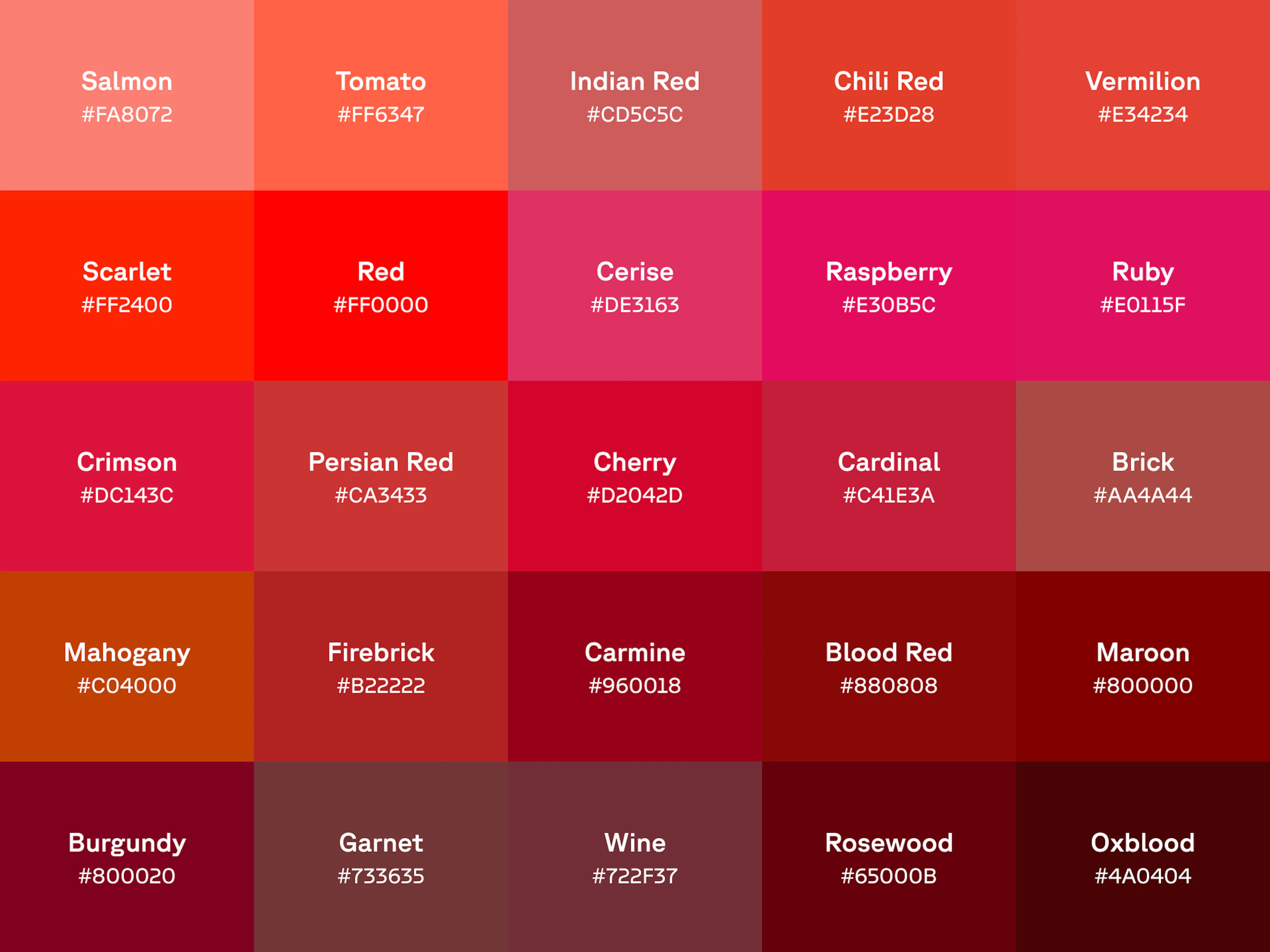
When it comes to choosing your red background, there’s a wider array of reds than you might think. We tend to picture that bright primary red, but there’s a whole spectrum: garnet, wine, mahogany, berry, and brick all make elevated, elegant dark red backgrounds.
Click a shade to copy its hex code, or download it as a ready-to-use background:
Cool reds are reds with a blue undertone — shades you might mentally file closer to purple, like maroon, magenta, burgundy, and crimson. Add a little yellow instead and you get warmer reds: the same base color becomes a warm tomato red or a cool raspberry. Colors, like most things, exist on a spectrum. Keep lightening and you leave red altogether for pink, a color with rules of its own.
Want even more? Explore the full shades of red collection.
Red gradient backgrounds
A gradient gives a red background depth without losing its punch. Here are six ready-made red gradients. Copy the CSS straight into a stylesheet, or download the full-resolution image. Want to build your own? Open CSS Gradient and roll a custom red.
What red means
Red carries more symbolic weight than almost any other color: danger and love, luck and loss, stop and go.
How stop signs informed the color red’s strength
First, let’s stop and analyze why red makes us halt and pay attention. That starts around the turn of the 20th century with a man named William Phelps Eno, who is largely acknowledged as the person who first came up with the idea of the stop sign. Eno — who, ironically enough, never actually learned how to drive — was alarmed by the steadily increasing amount of traffic on the road. In 1900 he published an article in Rider and Driver magazine entitled “Reforming Our Street Traffic Urgently Needed,” calling for stop signs at intersections. This was revolutionary in a lot of ways: street signs were pretty much an alien concept aside from the occasional road marker announcing an upcoming city, there were no lanes, and no speed limits. There also weren’t that many cars yet — the first American-made gasoline-powered automobile was sold in 1896 — but despite all this, Eno was very prescient about the need for stop signs.
In 1915, records show the first stop sign was installed in Detroit, which is apt as it’s known as the Motor City. But it wasn’t until 1954 that the Manual for Uniform Traffic Control Devices dictated that stop signs should be red moving forward. The reasoning? Red lights had always been used in traffic lights and railway signals to indicate stop. The reason red hadn’t been carried over to stop signs before then was lack of materials: no reflective red material durable enough to survive the elements existed until the 1940s and 1950s, when industrial companies finally produced the right material for the kind of stop signs that still exist today. Fire engines are red for the same reasons: the color grabs people’s attention and makes them think of words like “danger” and “emergency.”
Red means go. Or I love you ❤️
Paradoxically enough, while red signs have an arresting effect on people, red cars seem to speed things up. Some surveys indicate that people who drive red cars feel more assertive and aggressive behind the wheel. There’s also a longstanding rumor that red cars get more speeding tickets — but studies have borne that out as an old wives’ tale with no supporting statistics.
Red is iconic in many other realms as well. Red is widely associated with being the color of love (both romantic and courtly) and passion. Red roses are considered the ultimate romantic gift on Valentine’s Day — a practice that likely dates back to the Roman de la Rose, a French poem from the thirteenth century that was one of the most beloved pieces of literature in the Middle Ages. The poem is an allegorical journey in which the author searches a secluded garden for a red rose symbolizing the woman he loved. There’s also an entire discipline called floriography — the language of flowers — in which flowers send a secret message. In the Victorian era, when open romantic feeling was frowned upon, floriography let people communicate their most closely guarded feelings. In it, red roses simply meant “I love you,” and that message carries through to this day.
Incidentally, many people think a pair of Louboutin heels is a great gift: with their signature red bottoms, they’d certainly make an extravagantly romantic one.
Cultural significance of the color red
Red is steeped in cultural significance throughout the world. In Asian cultures in particular, red is an incredibly important and auspicious color, heralding good luck, prosperity, happiness, fertility, and celebration. In India and China, brides have traditionally worn red dresses to be married in; in China, red envelopes wrap gifts of money at Chinese New Year. But those positive associations aren’t universal: in many parts of Africa, red heralds mourning and death — the Red Cross has changed its logo to green and white in key parts of Africa, that’s how deep the symbolism goes. If you’re designing a website for a specific market, check what red means there first.
Word play with red
Red is such an evocative color, it’s used in a number of colloquial phrases. Here are just a few:
- Paint the town red: to celebrate with fun and abandon.
- Red herring: a sneaky distraction, often a dead end in a murder-mystery novel.
- Red eye: an overnight flight — or a coffee with a shot of espresso to recover from one.
- Red flag: a warning of danger, literal or figurative.
- Rolling out the red carpet: making someone feel high-profile and special.
- Seeing red: anger strong enough to practically cloud your vision.
- In the red: overdrawn and in debt — part of why red can provoke a visceral nervous reaction.
History of red
If you want more inspiration in the process of selecting a red background, dig into some art history. Just learning about the original creation of red pigments is bound to ignite your creative spark. People were creating their own red pigments for over 15,000 years. People in the Late Stone Age created red ochre, a clay pigment tinted red by the mineral hematite. Red ochre was used in ancient cave paintings: think of it as the original version of red wallpaper on a focal wall. But that’s not all they painted: ancient Egyptian women actually used red ochre to tint their lips and cheeks: it was an early take on makeup.
There are plenty of other fascinating red pigments throughout history. In Roman times, workers were forced to mine cinnabar, which was highly toxic but also extremely valuable and coveted. Crimson (one of those cool red backgrounds we discussed above) was originally made from dried and crushed scale insects called kermes. Crimson is similar to carmine: carmine was made from another scale insect called the cochineal. All in all, perhaps unsurprisingly, the history of red pigment is as bloodthirsty as it is beautiful.
Colophon
While Cool Backgrounds is a fine resource for generating images from popular javascript libraries, the real heavy lifting comes from the library authors themselves. When it comes to customer support, Quinn Rohlf from Trianglify.js is incredibly responsive and a really smart guy to boot. Particle.js is developed by Marc Brüderlin with a wonderful API and is being actively maintained. Gradient Topography is a newly minted project by me as a response to the amazing work by the Codrops crew. And of course Unsplash is one of the best internet treasures of all time, built by the former Crew team as a side project.
Oh yea and can’t forget CSS Gradient and Rellax.js which is the “cool background” that powers those sliding parallax shapes in the content section of this site!